Hamilton Bank is a community bank dedicated to building lasting relationships with small businesses, homeowners, individuals and entire families in Greater Baltimore. With more than a century of experience, Hamilton Bank has proven its stability, its reputation and its dedication to its customers.
Challenge
-
Hamilton Bank, founded in 1915, had built deep loyalty but was increasingly perceived as a traditional savings bank.
-
Younger audiences lacked awareness of the bank’s expanded services and multi-branch presence across Greater Baltimore.
-
Declining preference and market share made brand revitalization critical to long-term growth and stability.
Strategy
-
Led an integrated rebranding and marketing communications strategy to restore brand relevance and visibility.
-
Modernized the brand to balance Hamilton Bank’s heritage with future-focused growth and community commitment.
-
Executed a full suite of services including brand redesign, website design, public relations, advertising, media planning, and social strategy to ensure consistency across all touchpoints.
Results
-
Elevated the brand’s market presence, enabling expansion through acquisitions and increased competitiveness.
-
Repositioned Hamilton Bank to resonate with younger audiences while maintaining trust with existing customers.
-
Secured high-profile earned media coverage, including a full-page feature in the Baltimore Business Journal, along with continued regional and banking trade press exposure.
ADA Compliant Website
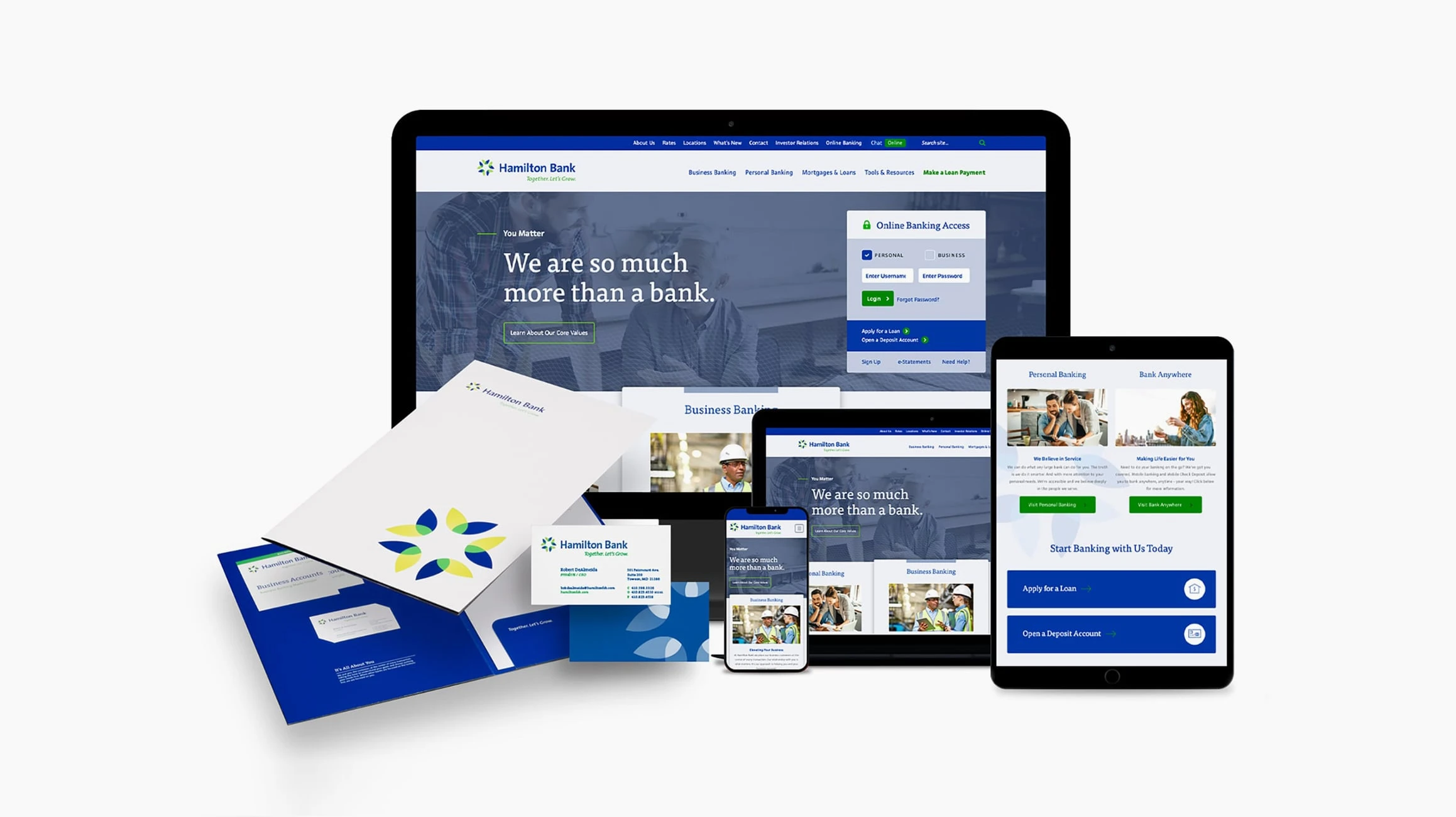
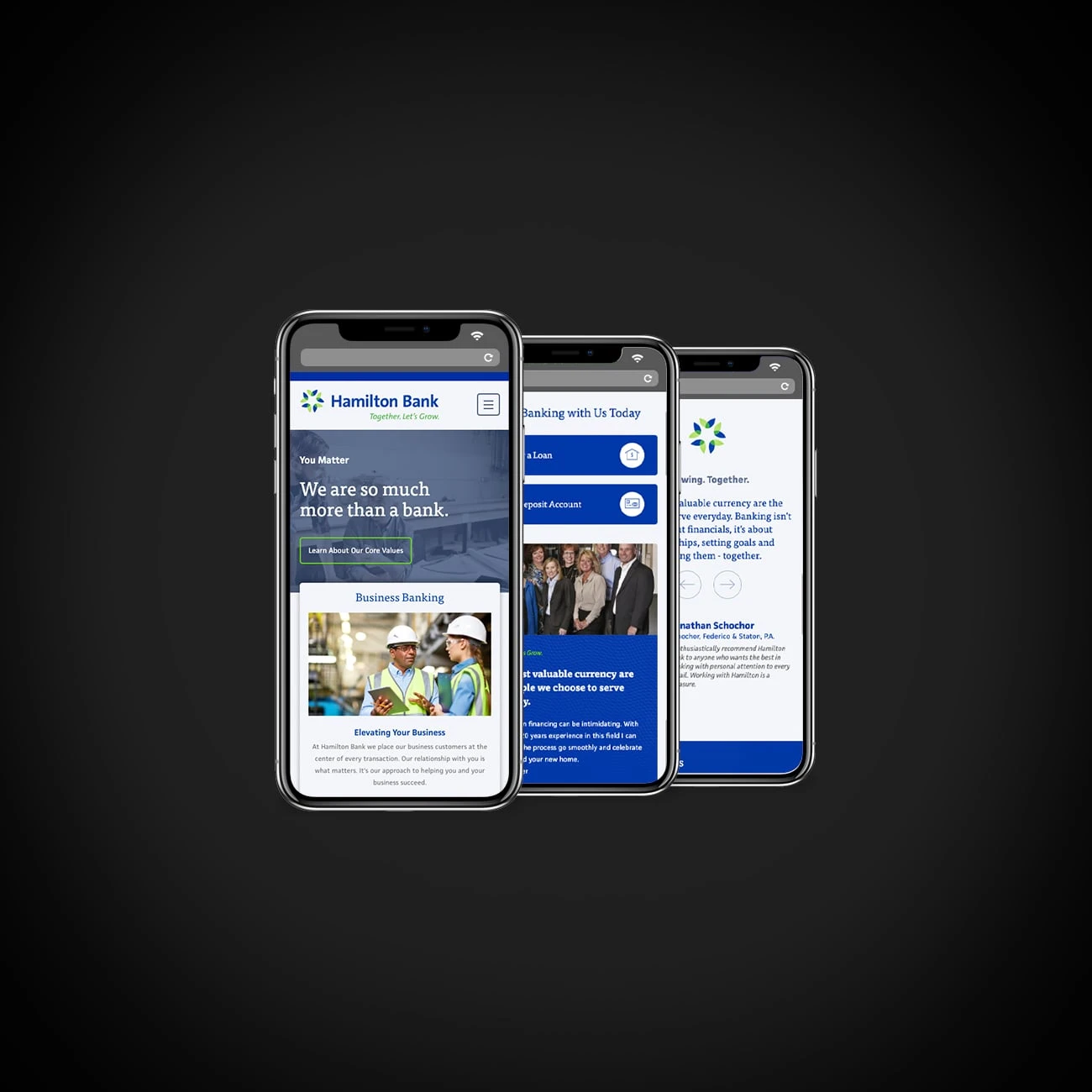
Hamilton Bank’s website makes the user experience as effortless and comfortable as possible. The sleek, clean design and clear navigation make the site intuitive and easy to use. The website also offers a collection of custom financial calculators so customers can find information on loans, constantly changing interest rates, and a myriad of other financial topics. Built on the WordPress platform, the site features a ground-up custom template, which allows site administrators to update and change content as needed, in-house.

Complete Rebrand
The initial logo exploration for Hamilton Bank resulted in over a dozen different, solid potential directions. Hamilton Bank’s final logo reflects the transformation from a traditional savings bank to a more diversified financial institution. The mark is fresh, friendly and attractive. Reflex blue was used to bring a bold, trustworthy look to the brand. The mark’s interconnected, circular pattern depicts the bank’s connection to the community along with a shared growth with customers.
Brand Collateral
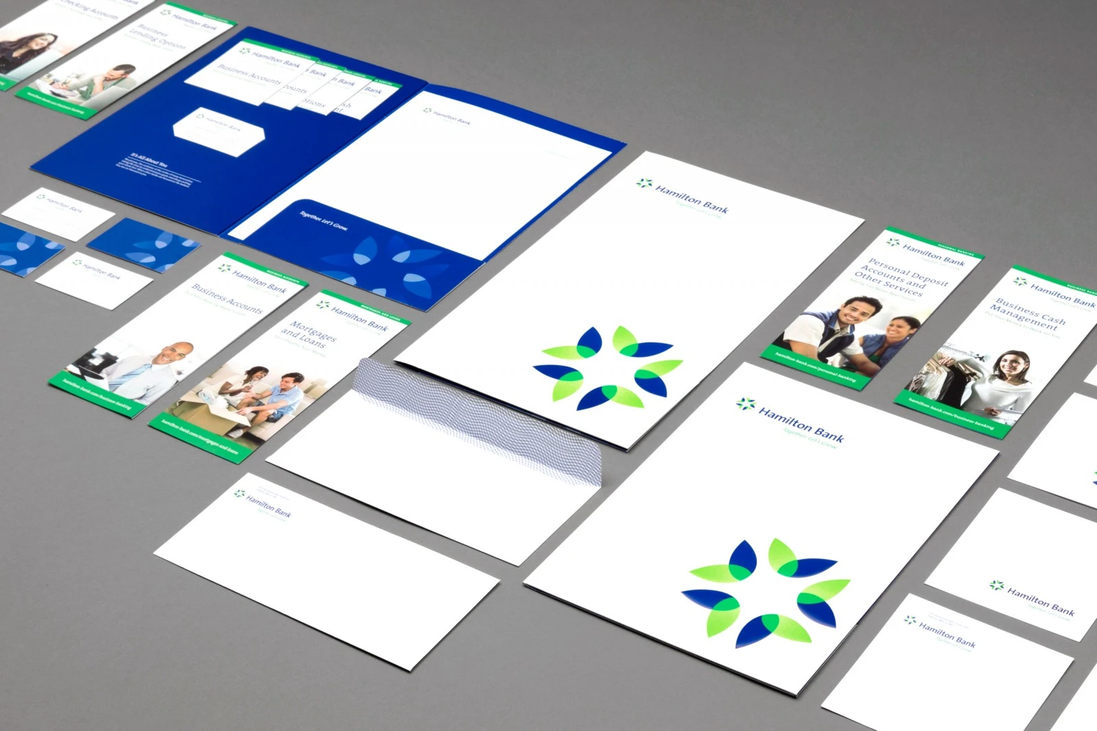
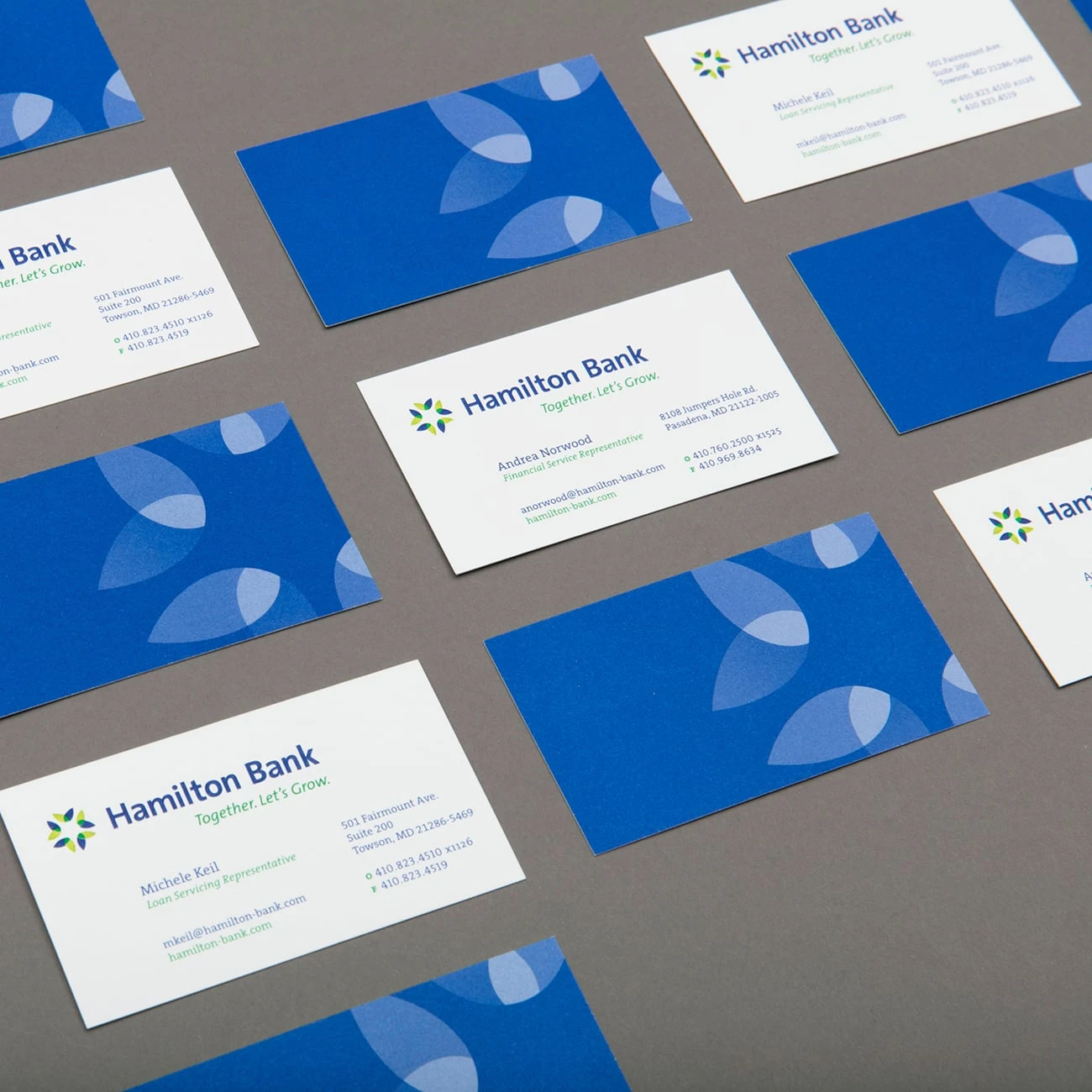
The stationery collateral and business cards fully reflect the fresh look of the new brand. The logo and tagline are presented on all printed materials in bright, highly saturated greens and blues that pop, showcasing Hamilton Bank as a contemporary brand with years of stability and hard work under its belt.
Custom Sales Kit
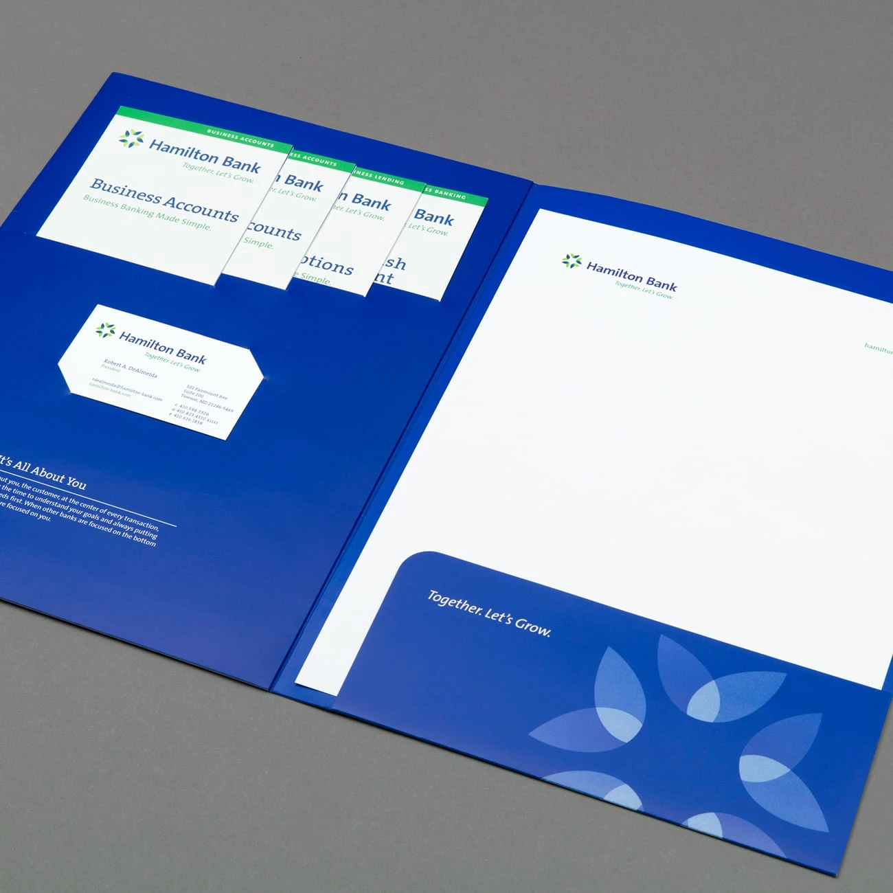
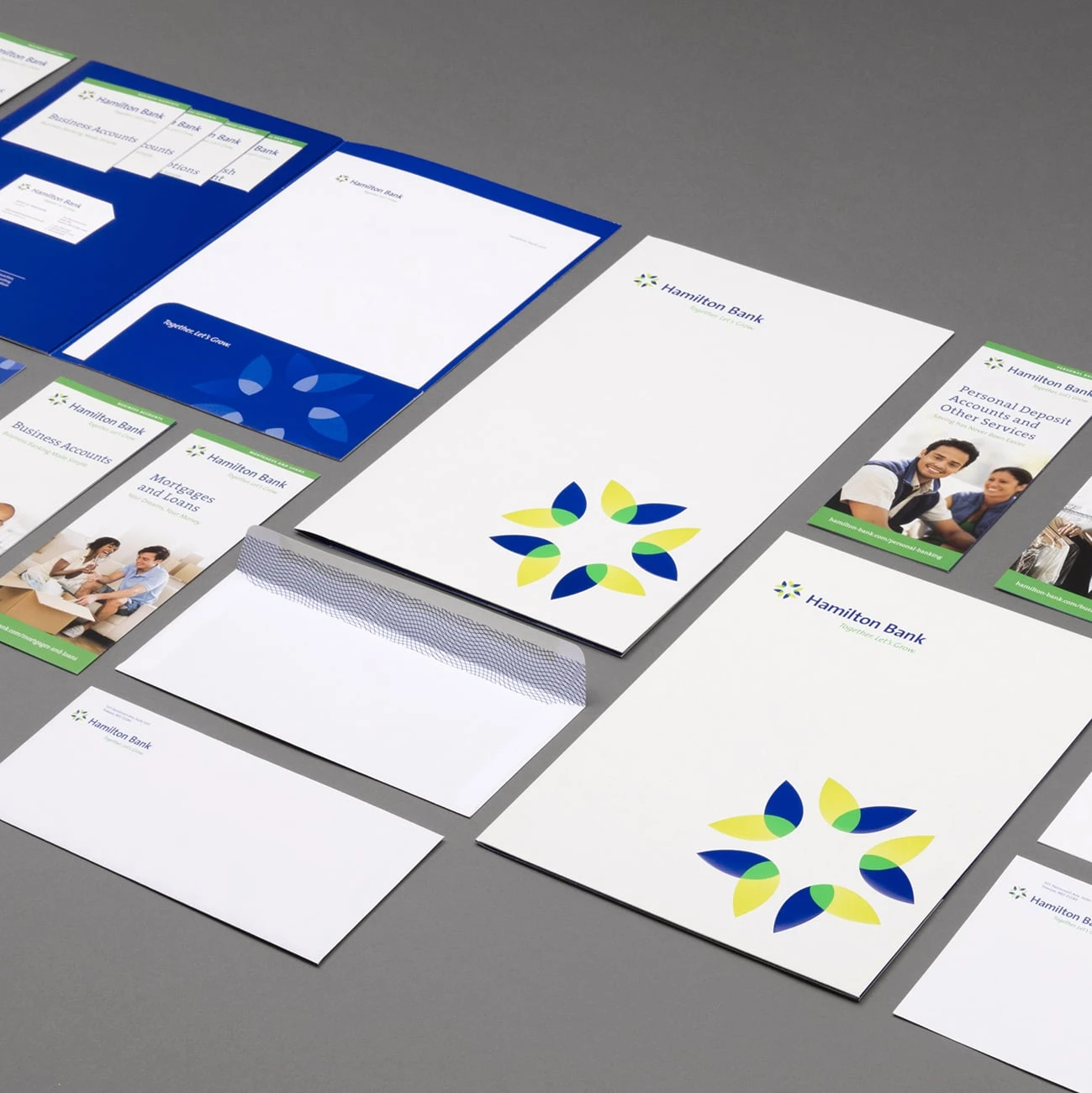
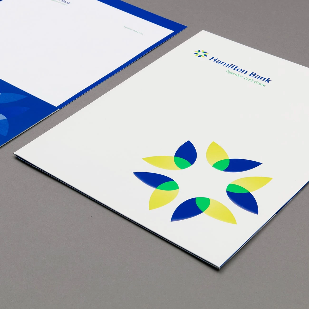
Vitamin designed a custom pocket folder, which was produced using high-quality, smooth, gloss paper and manufactured to receive a variety of delicate finishes and optimize color performance. The inside of this folder contains custom die-cuts designed to display four tri-fold brochures. The tri-fold brochures were custom designed to remain identifiable while housed within this system. Both logos on the front of the folder are embossed with hand-sculpted dies, which gives a layer effect to the emboss. This technique was leveraged to reinforce the visual layers that occur in the logo.
